Pictorialism is the name given to an international style and aesthetic movement that dominated photography during the later 19th and early 20th centuries. There is no standard definition of the term, but in general it refers to a style in which the photographer has somehow manipulated what would otherwise be a straightforward photograph as a means of “creating” an image rather than simply recording it. For the pictorialist, a photograph, like a painting, drawing or engraving, was a way of projecting an emotional intent into the viewer’s realm of imagination.
On the other hand, Secessionism was an early-20th-century movement that promoted photography as a fine art in general and photographic pictorialism in particular. A group of photographers, led by Alfred Stieglitz and F. Holland Day in the early 1900s, held the then controversial viewpoint that what was significant about a photograph was not what was in front of the camera but the manipulation of the image by the artist/photographer to achieve his or her subjective vision. The movement helped to raise standards and awareness of art photography.


There are many occasions in which the properties of photography as art have been questioned. One of the main arguments is that photography is just the representation of a reality with the use of modern technology. A photograph is not art when it just tries to justify or state a reality without expressing any emotional feeling. Fine art photography stands in contrast to photojournalism, which provides a visual account for news events, and commercial photography, the primary focus of which is to advertise products or services. In order for photography to be considered as art, it needs to be both compositionally and aesthetically pleasing, convey a mood or feeling, and be of archival quality.
Pictorialists used a variety of papers and chemical processes to produce particular effects, and some then manipulated the tones and surface of prints with brushes, ink or pigments. The following is a list of the most commonly used pictorial processes:
- Bromoil: This is a variant on the oil print process that allows a print to be enlarged. In this process a regular silver gelatin print is made, then bleached in a solution of potassium bichromate. This hardens the surface of the print and allows ink to stick to it. Both the lighter and darker areas of a bromoil print may be manipulated, providing a broader tonal range than an oil print.
- Carbon print: This is an extremely delicate print made by coating tissue paper with potassium bichromate, carbon black or another pigment and gelatin. Carbon prints can provide extraordinary detail and are among the most permanent of all photographic prints. Due to the stability of the paper both before and after processing, carbon-printing tissue was one of the earliest commercially made photographic products.
- Cyanotype: One of the earliest photographic processes, cyanotypes experienced a brief renewal when pictorialists experimented with their deep blue colour tones. The colour came from coating paper with light-sensitive iron salts.
- Gum bichromate: One of the pictorialists’ favourites, these prints were made by applying gum Arabic, potassium bichromate and one or more coloured pigments to paper. This sensitized solution slowly hardens where light strikes it, and these areas remain pliable for several hours. The photographer had a great deal of control by varying the mixture of the solution, allowing a shorter or longer exposure and by brushing or rubbing the pigmented areas after exposure.
The Bromoil Process
The bromoil process was invented in 1907; the theory was put down on paper by E.J. Wall, and set into practice by C. Welborne Piper. The intention was to create a method of producing an inked image from an enlarged negative as an improvement of the oil transfer process, which required a negative the same size as the desired print. The dreamy, painterly appearance of bromoil prints was very popular with the Pictoralist movement. The process itself is based on the principle that oil and water repel one another, and is used to create a photographic image made from ink. The process begins with an ordinary silver gelatin print, which is a photographic image printed on special paper containing a light-sensitive emulsion of silver crystals and gelatin. The finished print is soaked in a bleaching solution of potassium dichromate and other chemicals. This washes the silver crystals from the photographic paper and tans the gelatin so that a faint trace of the image can still be seen. This bleached print is called a “matrix.” After drying, the print is soaked in water before an oil-based ink is applied to the surface. The ink is absorbed by the water-swollen gelatin in direct proportion to the amount of silver in the original image; therefore, the water-swollen highlights repel the ink while the bleach-hardened shadows absorb it. Using any variety of techniques, including brushwork, use of a brayer or roller, and even more unconventional tools such as cosmetic sponges a unique image can be created. Because of the need to ink the image by hand, every print is one of a kind. Source: http://sbc.edu/sites/default/files/Honors/CBonanno.pdf
Digital recreation of a bromoil print using Photoshop
To reproduce a bromoil process digitally, one can apply in camera techniques such as adjusting the focus or intentionally blurring a scene or subject to produce a softer image and create movement. The type of lens being used can also help recreate a bromoil scene digitally. For example, a wide-angle lens can be used to distort the image and create uneven lines to replicate an impressionistic style artwork. Increasing the ISO can also help create noise in the image to replicate the grainy characteristics of bromoil images. Other accessories such as filters can also assist in reproducing a bromoil image digitally. For instance, warming filters can be used to create a warm tone over the overall image. Even coloured filters can be used to create a colour cast over an image. Post-processing software, such as Photoshop, will be most effective in trying to replicate the effects of bromoil, because like the original darkroom process, Photoshop allows for the manipulation of tonal ranges. Photoshop also allows for other effects such as, dodging & burning, B&W, Sepia and other coloured tones. It also offers brushes and built-in filters to create painterly affects. One can also add noise, dust and scratches and blur to an image to try and replicate the style of bromoil images.
Impressionism & Pictorialism
The relationship between pictorialism and impressionism is intertwined, with both movements having an important influence on each other. Impressionism is a 19th-century art movement that originated with a group of Paris-based artists. Impressionist painting characteristics included relatively small, thin, yet visible brush strokes, open composition, emphasis on accurate depiction of light in its changing qualities, common and ordinary subject matter, inclusion of movement as a crucial element of human perception and unusual visual angles. The pictorialist photographers asserted that photography could contain as much artistic merit as painting could and sought to elevate photography to the realms of fine art. At this time, impressionist painting was rising to popularity and exerted a heavy influence on pictorialist efforts. Pictorialists aimed to emulate the impressionistic effect through pre and post-exposure techniques such as soft focus, heavy darkroom manipulations, hand scratching the negatives and using brushes to soften and blur parts of the photographs during the printing process. Like the impressionists, the pictorialists placed more importance on the aesthetics and the emotional impact of the image, than what was in front of the camera.
Nevertheless, the development of impressionism can be considered partly as a reaction by artists to the challenge presented by photography, which seemed to devalue the artist’s skill in reproducing reality. Perhaps no invention of the 19th century influenced impressionism more than the camera. Use of a camera helped artists study movement and gestures to capture a sense of real-life spontaneity. It also showed the tonal effects of light and dark in much more finer detail; making it easier for artists to capture the tone in their compositions. More importantly, it allowed them to experiment with off-centre compositions, optical realism and deep perspectives.
Comparison: The Hand of Man (Alfred Stieglitz, 1902) vs. Train in the Snow (Claude Monet, 1875)
There are stifling similarities when you compare Stieglitz’s photo, The Hand of Man, against impressionist painter, Claude Monet’s, Train in the Snow. First of all, Stieglitz’s and other pictorialists were heavily influenced by impressionism; their style, their compositions and even their subject matter. The impressionists were interested in subject matter that related to the rise of the industrial revolution, the imagery of the city, the steam locomotive, as well as, various landscape and outdoor scenes.


In their images, both Stieglitz and Monet have decided to portray the same subject in their work – the steam locomotive. However it is not so much the subject choice that bears the greatest similarities, it is their attempt to emphasize the emotional atmosphere rather than the subject itself. The use of soft focus and short brush strokes meant sacrificing much detail in their subject in order to capture the atmosphere of a particular time of day and create mood in their images. Monet tries to capture the stark wintry conditions on the urban landscape, whilst Stieglitz creates a harsh industrial atmosphere filled with smog and haze. Both artists achieve the purpose of their images; to invoke an emotional response or connection between the viewer and the image, and create a feeling of being there. This is also achieved through the use of tone – the gradations between highlights and shadows. Both images use predominantly dark tones to try and emulate the environment and atmosphere in which their subjects are set. There is not much shadow detail in both artworks, creating an almost silhouette like depiction of the subject matter, instead relying on outline and shape to allow the viewer to determine what the objects in the image are.
The composition of both images is also strikingly similar, with both artists attempting to depict movement in their image by positioning the locomotive on an angle. The main subject in both artworks is positioned off centre (which was a common compositional technique used by the impressionists) and placed within the rule of thirds. Both artworks use leading lines to draw the eye to the subject, as well as, create diminishing perspective and imply volume. In terms of colour, Stieglitz’s image is monochromatic but has a warm sepia tone that creates a disconsolate mood and further accentuates the industrial atmosphere. On the other hand, the development of colour theory during the impressionist era really aids the composition of Monet’s work. The dominant hues of blue help construct the cold wintry landscape and emphasize the melancholic mood of the image. Above all, the colours all work well together to create harmony in the composition.
Individual Study of Pictorialism
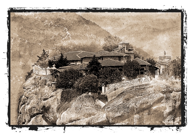
The area of pictorialism I have decided to study is landscape pictorialism. Landscape photography was an excellent means for the pictorialist photographers to express their vision of an ideal world. This is one of the main reasons why landscape photography is one of the leading subjects in pictorialist photography. Just like the painters, the pictorialist photographers left their studios to discover the light and the open air. They also sought to capture the atmosphere of a particular scene and focussed more on the aesthetics and emotional impact of the image, rather than the subject itself. Pictorialist techniques often involved using soft focus or blurring a scene, applying a warm tone to an image, scratching or etching on the film negative and applying inks or brush strokes to the final print in order to achieve their artistic vision.
The below image is my attempt at creating a pictorialist style landscape using a digital camera. In line with the pictorialist technique, the image is soft and not entirely in focus. I have applied various post production techniques such as noise, dust and scratches, and brush stroke affects to emulate the painterly effect that can be seen in many pictorialist landscape images.

Goran Sekulovski, ‘Little Bay’, 2012

Pingback: Outcome 2 3B | Mansong Photos·